Dashboard charts
Visualize Your Data with ExpiWell Dashboards
ExpiWell’s data "Dashboards" allow you to visualize your data in real-time. You can see trends and patterns as they occur! Our dashboard charts convert participants' raw data into intuitive visuals for easier interpretation and trend identification. They highlight patterns in participant behavior or metrics over time, especially during longitudinal studies. They also allow comparisons between different participant groups or variables and provide actionable insights for strategic adjustments.
Applications of the Five Types of Dashboard Charts
1. Vertical Bar Chart & Horizontal Bar Chart
-
Applicable Question Types: Single Selection, Text Numeric, Drop Down, Scale
-
Data Calculation & Display: Displays daily data; sum and mean are calculated per day.
-
X-Axis Variable Options: Date (default), Survey Timestamp, Day Number, or Survey Name
-
Best Use Cases:
-
Comparing participation rates, engagement levels, or performance across different categories.
-
Ranking participant responses based on frequency or trends over time.
-
Identifying high and low engagement patterns.
2. Scatter Chart
-
Applicable Question Types: Single Selection, Text Numeric, Drop Down, Scale
-
Data Calculation & Display: Displays daily data; sum and mean are calculated per day.
-
Best Use Cases:
-
Identifying correlations between two variables, such as age vs. participation frequency.
-
Analyzing behavioral trends and detecting clusters in participant responses.
-
Spotting outliers or anomalies in engagement patterns.
3. Table Chart
-
Applicable Question Types: Single Selection, Text Numeric, Drop Down, Scale, Text Question
-
Data Calculation & Display: Displays daily, weekly, or all data.
-
Daily View: Allows selection of specific date(s) for granular analysis.
-
Weekly View: Aggregates data over a week but does not calculate the sum or mean.
-
All View: Shows all collected data for the project duration
-
Best Use Cases:
-
Viewing detailed participant responses in a structured tabular format.
-
Providing both specific date-based and broader weekly trends.
-
Analyzing raw numeric data without additional calculations.
4. Point-Line Chart
-
Applicable Question Types: Text Numeric
-
Data Calculation & Display: Displays weekly aggregated data; the sum and mean are calculated per week.
-
Best Use Cases:
-
Tracking long-term trends in participant data over multiple weeks.
-
Observing changes in performance or engagement over time.
-
Comparing week-over-week fluctuations using numerical inputs
Setting up Dashboard Charts
This section provides a step-by-step guide on setting up a dashboard visualization chart. It also outlines the five types of visualization charts, covering Chart Appearance, configuration settings in the Visualization Tab, customization options in the Customization Tab, and additional functionality in the Actions Tab (applicable only to vertical and horizontal bar charts).
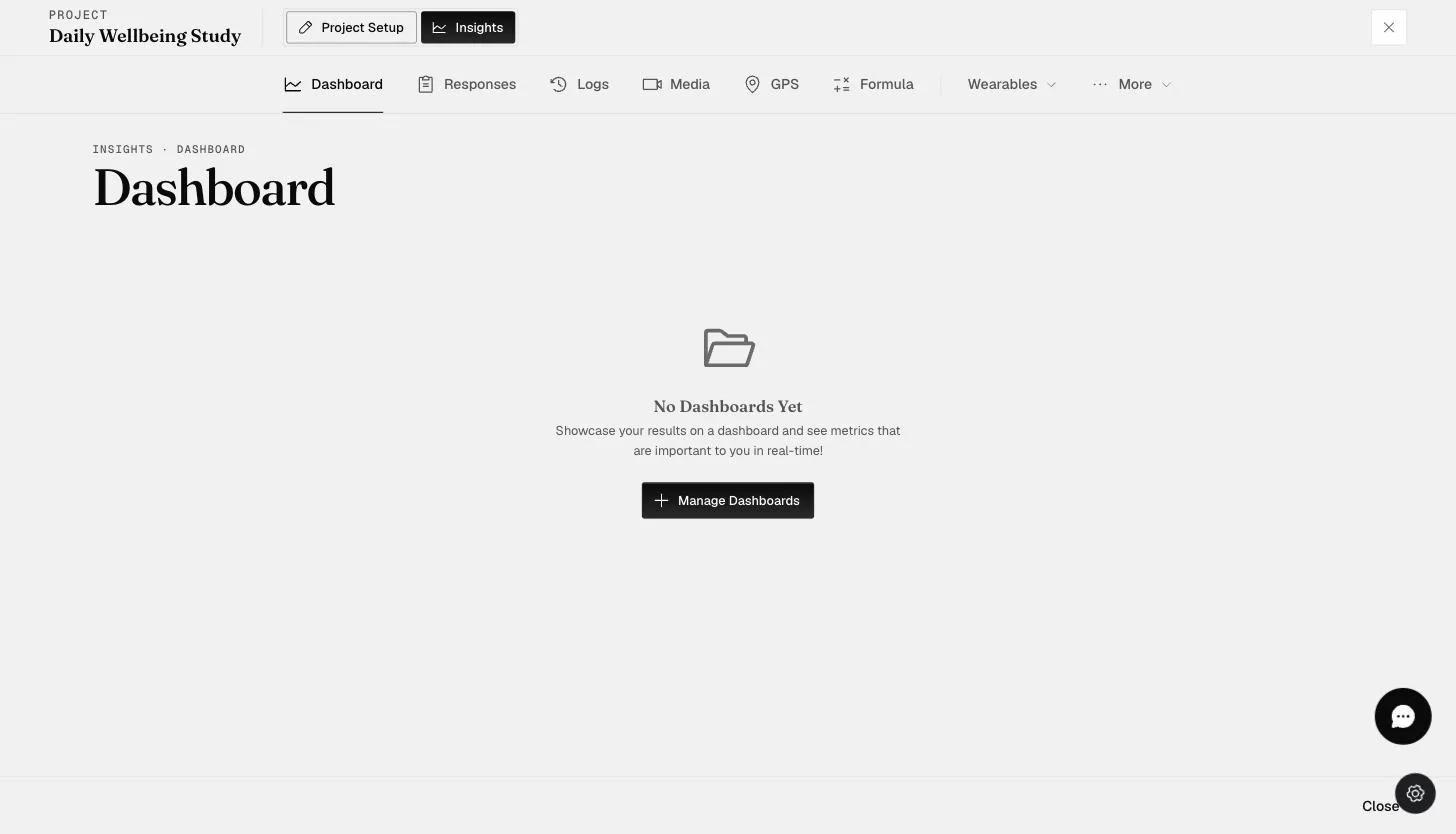
- On the 'Insights' page, click on the 'Dashboard' tab and 'Manage Dashboards' to start a new dashboard for your data.
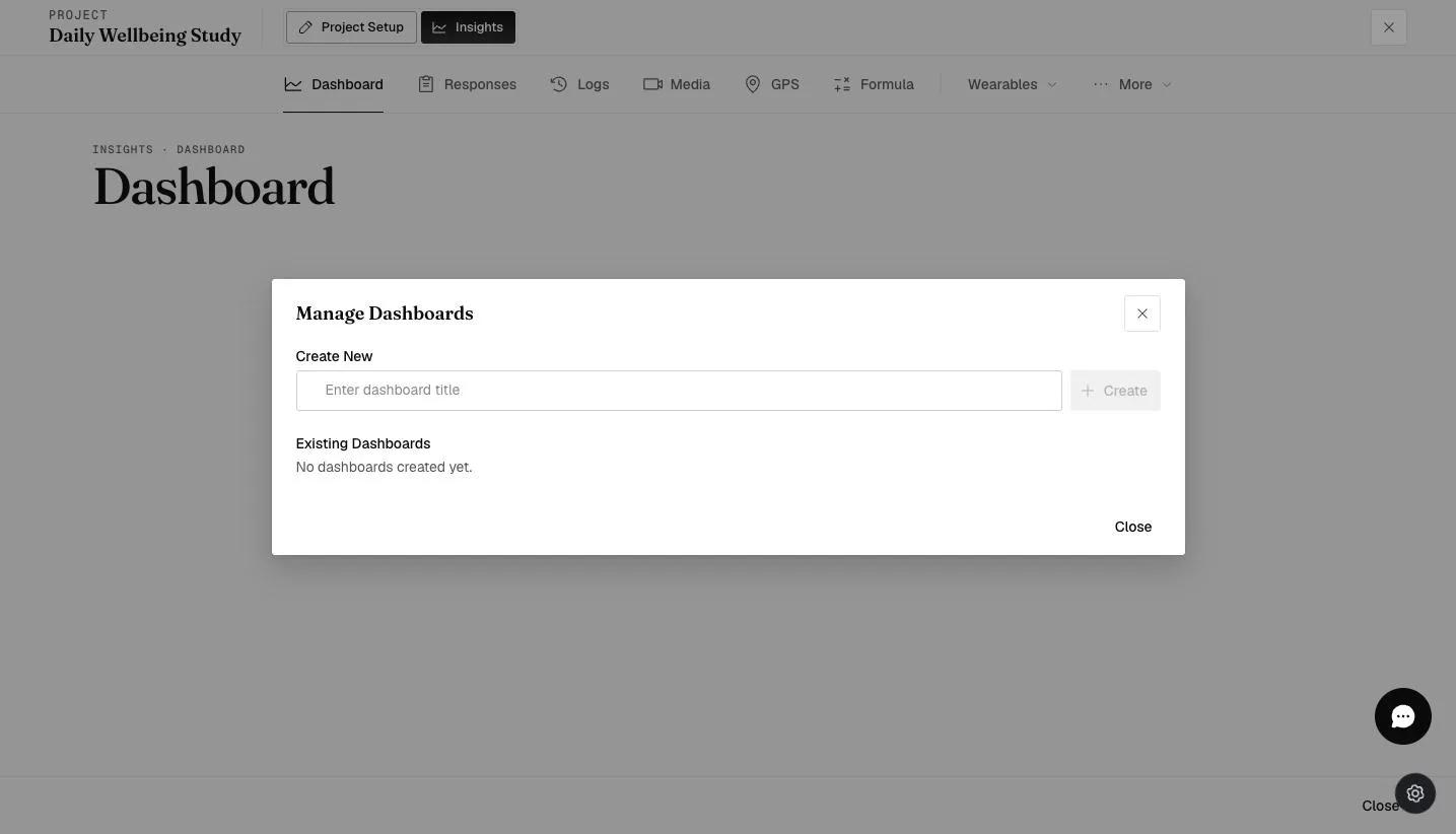
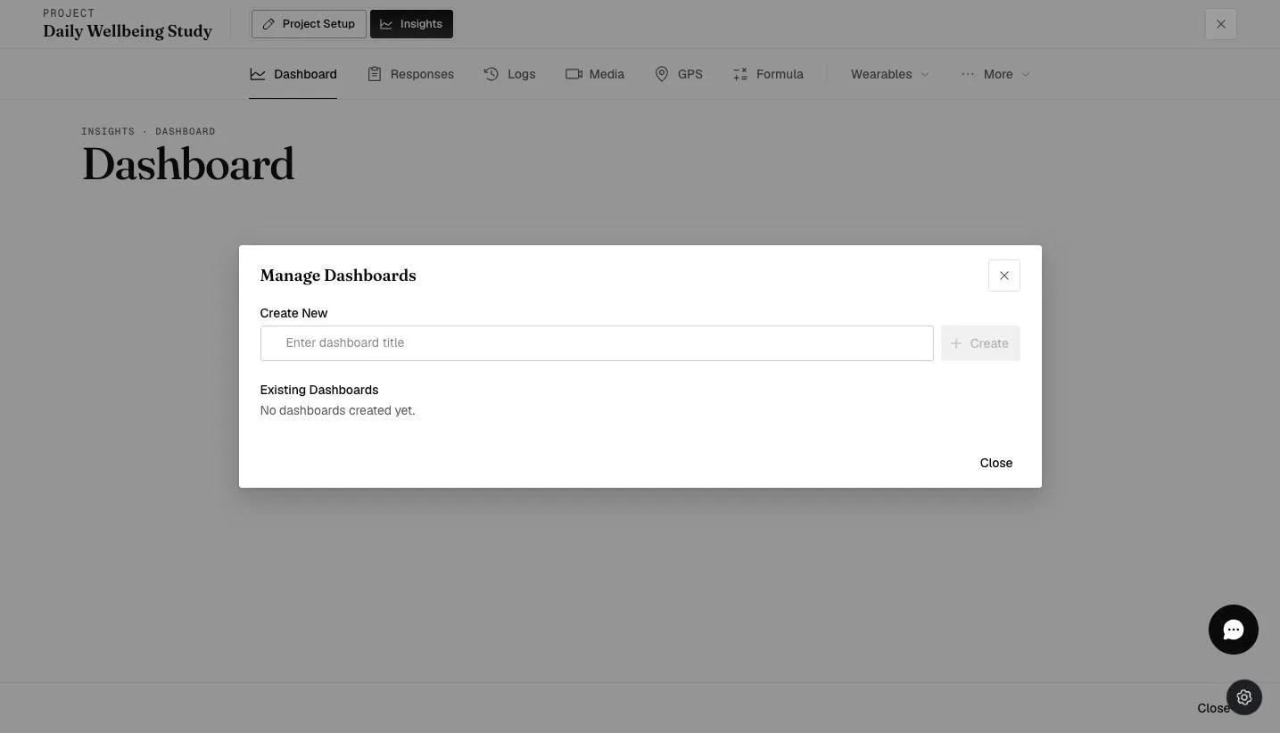
- In the 'Create New' section, enter a dashboard title and click 'Create'.
- The created dashboard will appear. The number of visualizations, along with options to edit the name and delete this dashboard, will also be shown.
- To create a new visualization chart, click 'New Visualization'.
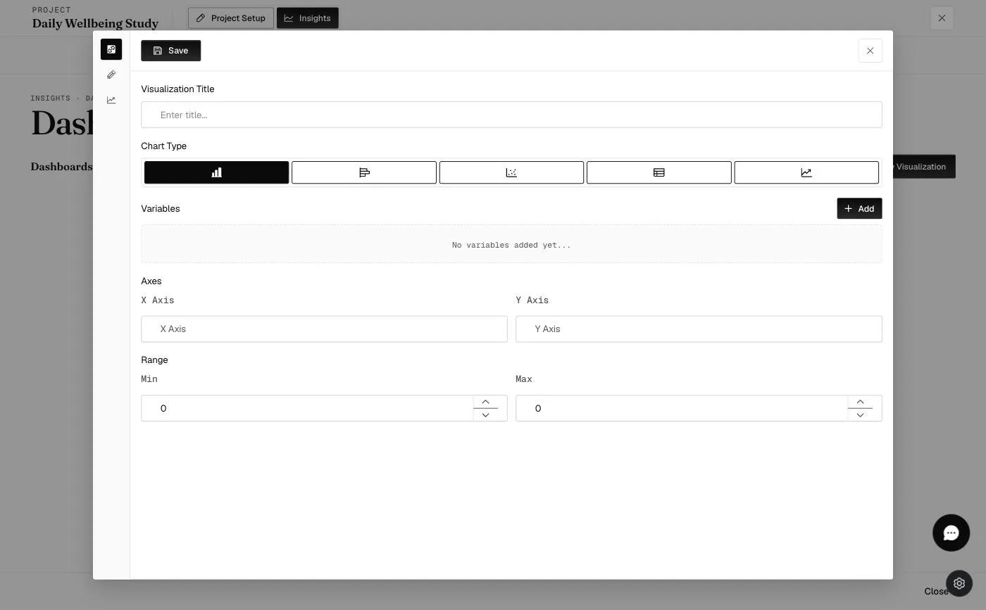
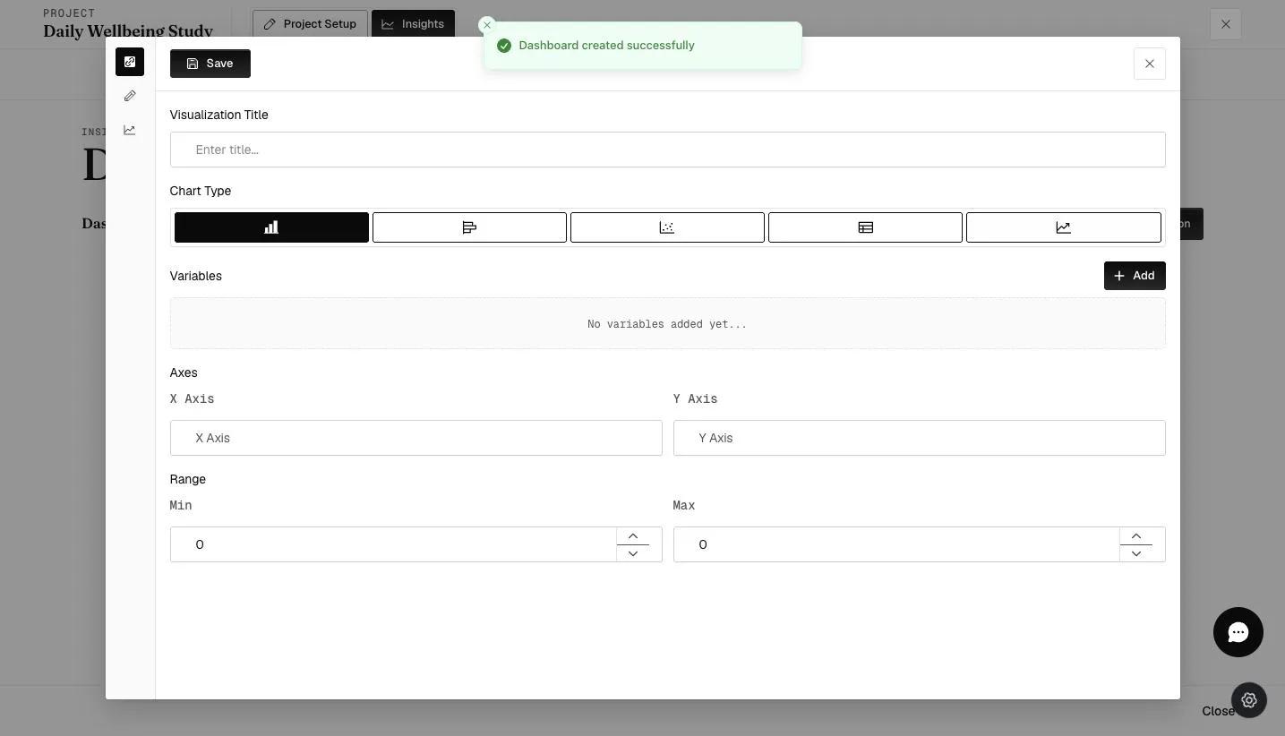
- A new Visualization tab will appear. Enter the chart title and select the appropriate chart type.
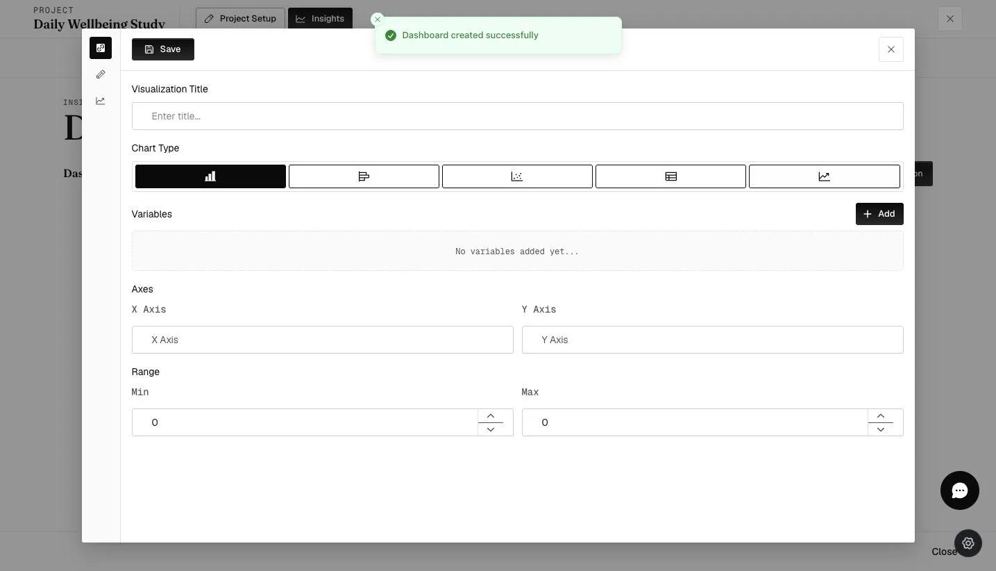
New Feature: X-Axis Variable Options: Use the dropdown to define the horizontal axis format for Bar Charts. This allows you to control how data is grouped and displayed:
-
Date (Default): Displays the specific calendar dates of survey submissions (MM/DD)
-
Survey Timestamp: Shows high-fidelity time data, including both the date and the specific time of submission.
-
Day Number: Displays the relative day of the study according to the Rolling Schedule (e.g., Day 1, Day 2). This collates all participant data by their progress in the study, regardless of their actual start date.
-
Survey Name: Uses the specific survey names of the selected survey questions as categorical labels on the X-axis.
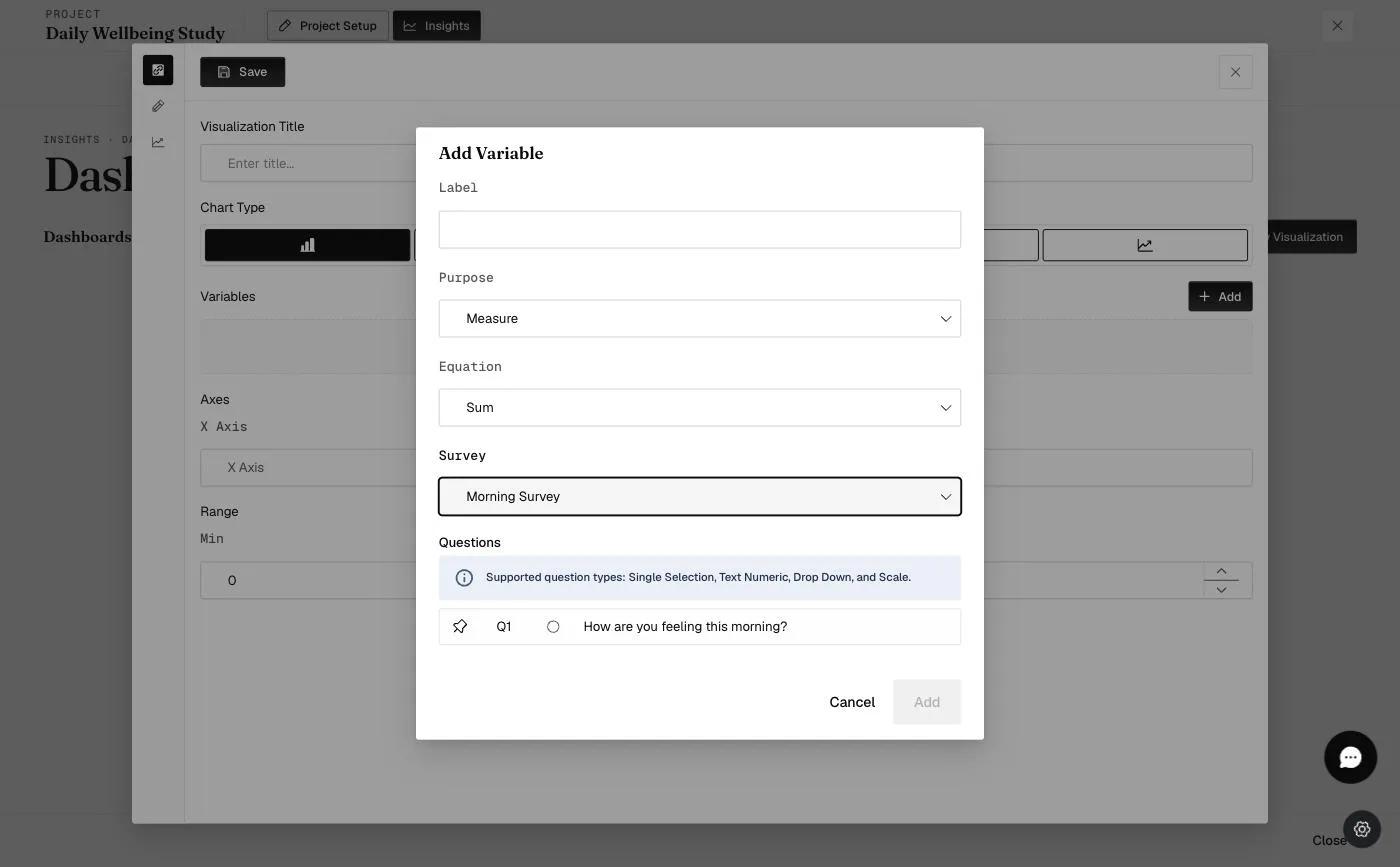
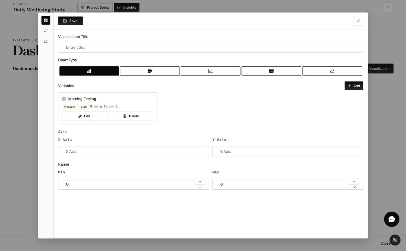
- Input the required variables by selecting a variable label, choosing a calculation (either mean or sum), and selecting a question from a survey within the project to calculate the data.
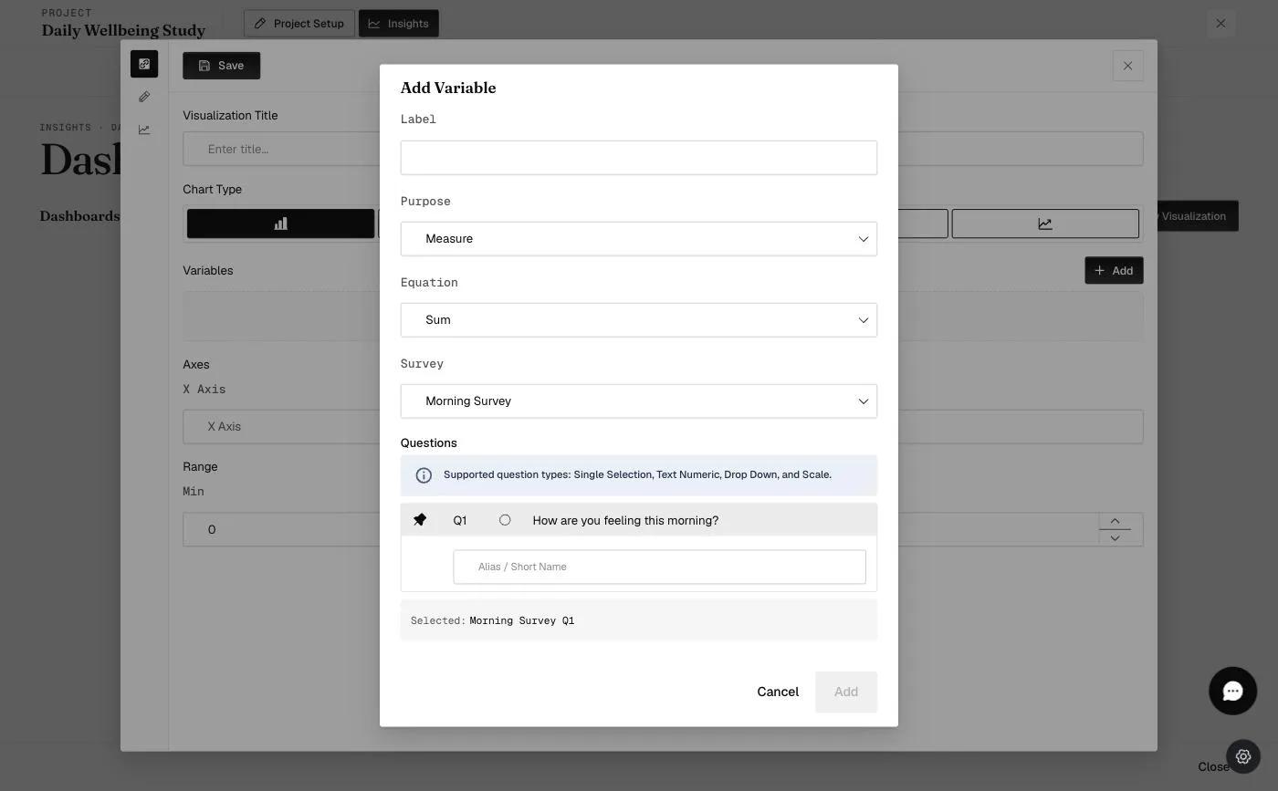
New Feature: Alias / Short Name: You can now enter an optional Alias for any survey question. This short name will be used in Table Chart Headers and will appear when data points are hovered over, preventing long questions from clipping or cluttering the UI.
Click the 'Add' button to confirm the variable settings ('Save' when editing an existing variable).
Pro-Tip: If your survey question is "How stressed do you feel right now?", you can set the Alias to "Stress Level". This keeps your hover-tooltips clean and easy to read, as shown in the example below.
- Click on the Customization tab (indicated by the red box) to personalize colors for labels and variables, define the highlighted data zone, and set label positions. Click on the blue 'arrow' button (indicated by the orange arrow) to view your new visualization chart.
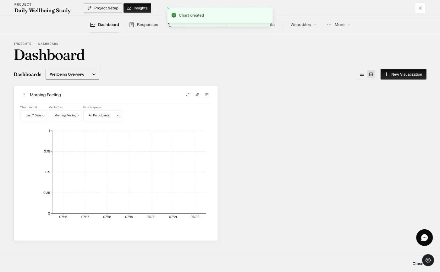
- The new visualization chart will appear on your dashboard.
Note: The detailed data table will now appear below the chart, rather than beside it, when a data point is selected.
New Feature: Dashboard Workspace & Layouts: At the top of your dashboard, you can now toggle between Single Column (full-width) and Tile View (grid) layouts.
-
Single Column: Best for viewing the detailed data table at full width below your chart.
-
Tile View: Best for comparing multiple visualizations side-by-side.
New Feature: Drag-and-Drop Reordering: You can manually rearrange your charts to prioritize key visuals. Click and hold the Drag Handle (⋮⋮) on any component to move it. Your layout and order are automatically saved for future sessions.
- The horizontal and vertical bar charts include an additional Actions tab, which enables users to view divergence for both charts and the normal distribution for the vertical bar chart.
Vertical Bar Chart
Chart Appearance
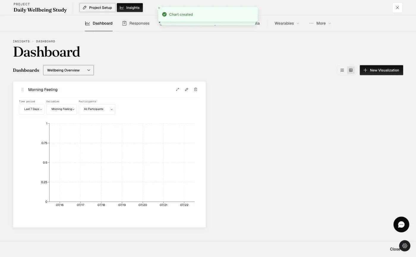
Note: The detailed data table will now appear below the chart, rather than beside it, when a data point is selected.
Time Period: View data from the last 7, 30, or 90 days.
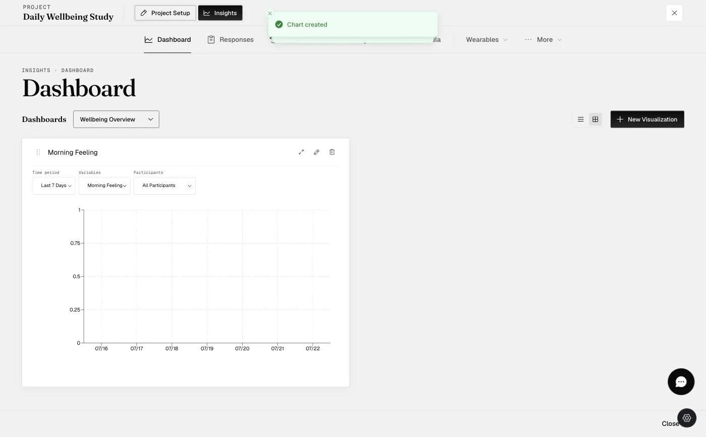
Variables: Variables created will be seen in the variables dropdown list below the chart.
Participants: List of participants who have filled out the surveys.
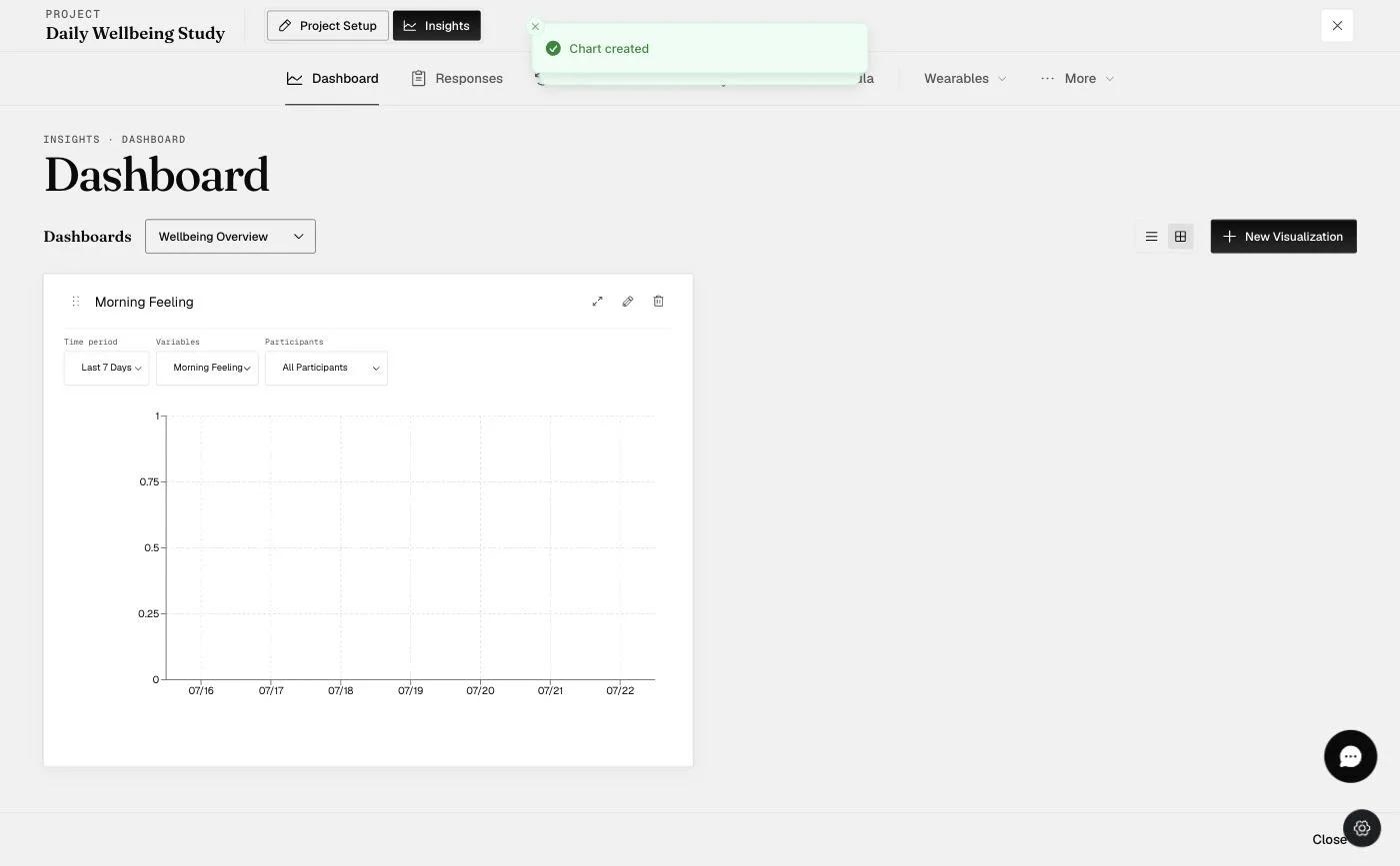
Question & Response List: When a data point on the chart is selected, the respective list of questions and answers for that data point will be shown below.
Visualization Tab
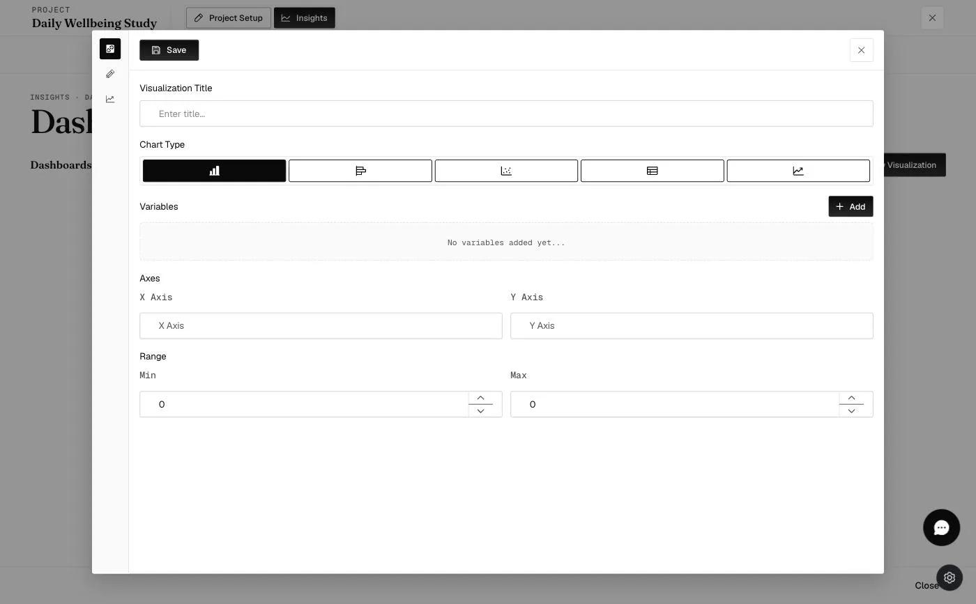
Visualization Title: The title displayed at the top of the chart, i.e., the chart title.
Visualization Type: Select the type of chart to create.
X Axis: Label for the x-axis.
Y Axis: Label for the y-axis.
Color Range: Input minimum and maximum values to display a specific colored zone.
Variables:
Label: The variable label will be displayed in the variable dropdown list on the chart.
Purpose: Only one option, 'Measure', is present; two options in the Equation will appear upon selection.
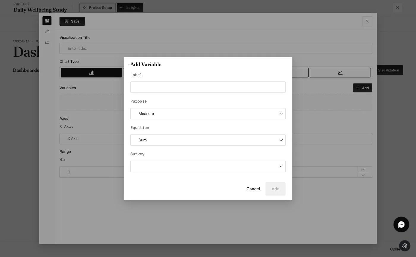
Equation: Two options: Sum and Mean. The ‘sum’ will sum up all the answers' scores for the day. The ‘mean’ will calculate the total average daily score.
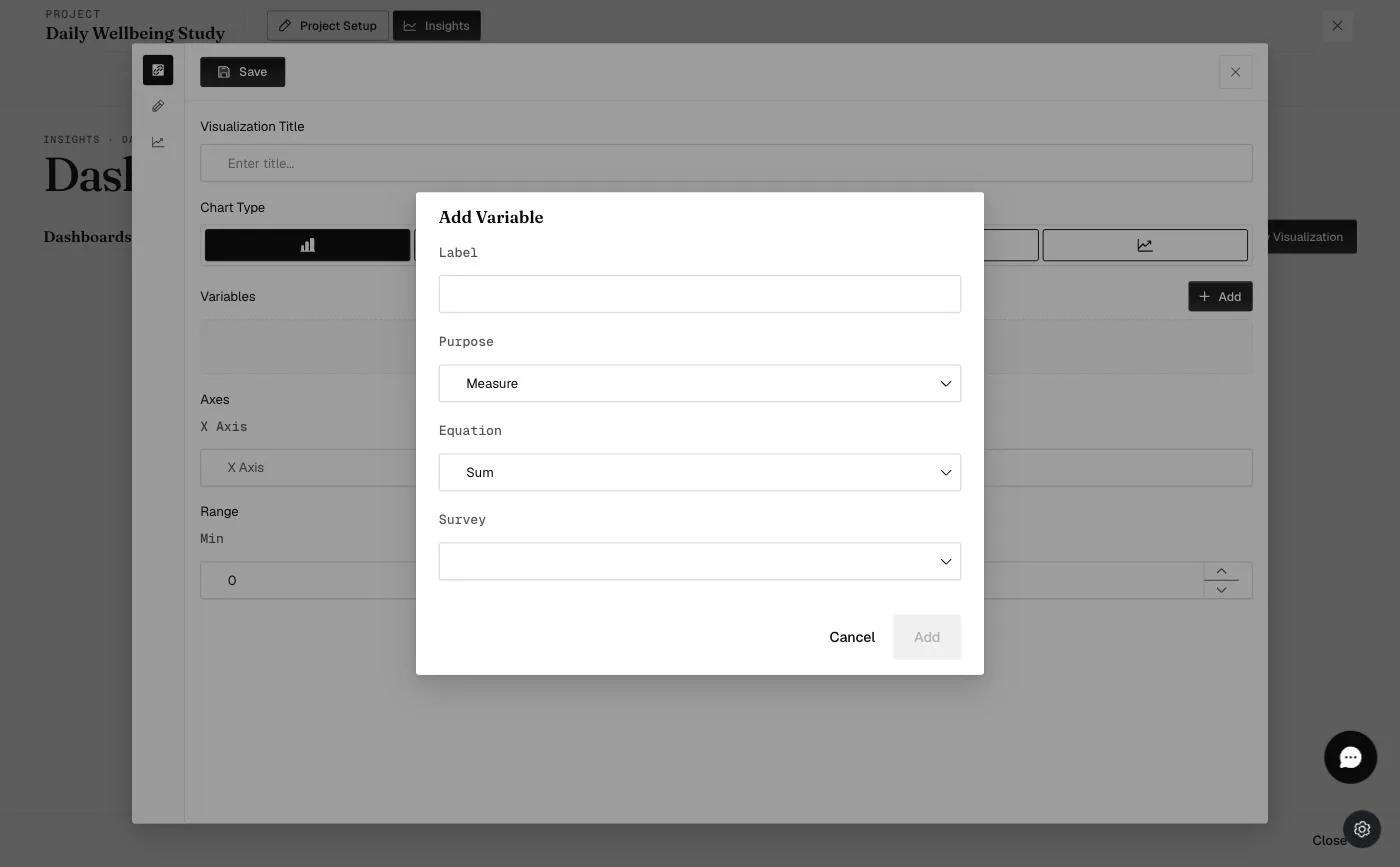
Questions: Displays the list of all selected questions.
Survey: Displays the list of surveys for that project.
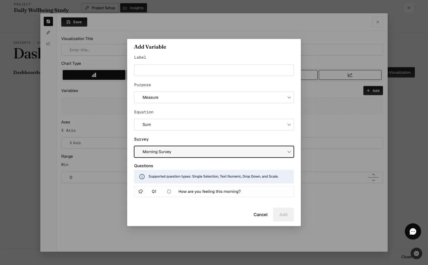
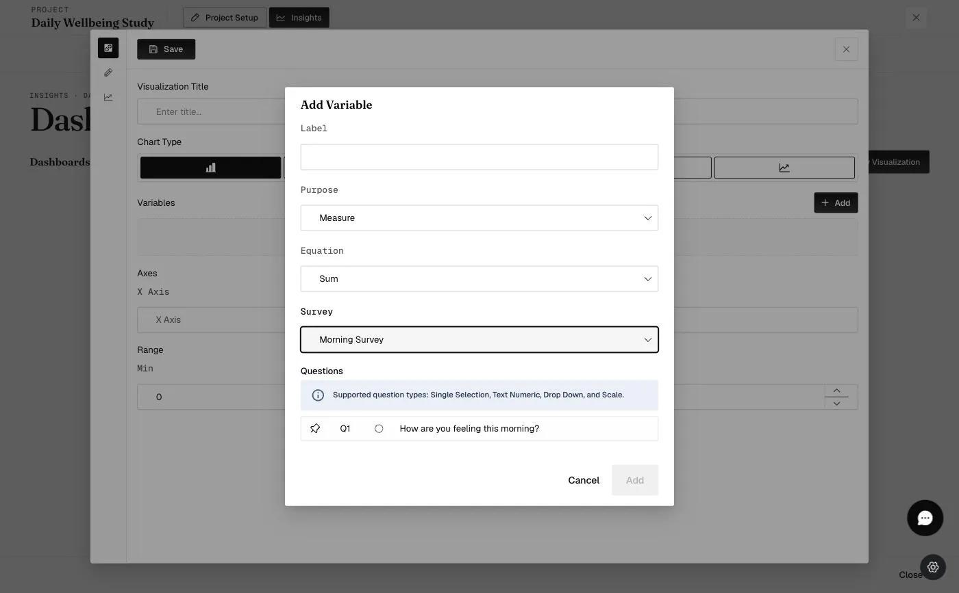
When a survey is selected, the list of questions from that survey will be available. The four question types that can be chosen for the vertical bar chart are Single-selection, Text-numeric, Drop-down, and Scale.
Customization Tab
Customization: Allows the selection of color for that specific variable to be displayed on the chart.
X Axis: Allows the selection of the position and color of the x-axis title, the color of the x-axis label, and the style and color of the x-axis grid.
Y Axis: This option allows you to select the position and color of the y-axis title, the color of the y-axis label, and the style and color of the y-axis grid.
Range: Allows the selection of color for the zone range.
Based on the above settings, the output of the chart will be as shown:
Actions Tab
Divergence: When divergence is enabled, a divergence line appears, as shown below. The color and style of the divergence line can be selected.
Normal Distribution: When normal distribution is enabled, a normal distribution line appears, as shown below. The color and style of the normal distribution line can be selected.
Horizontal Bar Chart
Chart Appearance
Note: The detailed data table will now appear below the chart, rather than beside it, when a data point is selected.
Time Period: View data from the last 7, 30, or 90 days.
Variables: Variables created will be seen in the variables dropdown list below the chart.
Participants: List of participants who have filled out the surveys.
Question & Response List: When a data point on the chart is selected, the respective list of questions and answers for that data point will be shown below.
Visualization Tab
Visualization Title: The title displayed at the top of the chart, i.e., the chart title.
Visualization Type: Select the type of chart to create.
X Axis: Label for the x-axis.
Y Axis: Label for the y-axis.
Color Range: Input minimum and maximum values to display a specific colored zone.
Variables:
Label: The variable label will be displayed in the variable dropdown list on the chart.
Purpose: Only one option, 'Measure', is present; two options in the Equation will appear upon selection.
Equation: Two options: Sum and Mean. The ‘sum’ will sum up all the answers' scores for the day. The ‘mean’ will calculate the total average daily score.
Questions: Displays the list of all selected questions.
Survey: Displays the list of surveys for that project.
When a survey is selected, the list of questions from that survey will be available. The four question types that can be chosen for the horizontal bar chart are Single-selection, Text-numeric, Drop-down, and Scale.
Customization Tab
Customization: Allows the selection of color for that specific variable to be displayed on the chart.
X Axis: Allows the selection of the position and color of the x-axis title, the color of the x-axis label, and the style and color of the x-axis grid.
Y Axis: Allows the selection of the position and color of the y-axis title, the color of the y-axis label, and the style and color of the y-axis grid.
Range: Allows the selection of color for the zone range.
Based on the above settings, the output of the chart will be as shown:
Actions Tab
Divergence: When divergence is enabled, a divergence line appears, as shown below. The color and style of the divergence line can be selected.
Scatter Chart
Chart Appearance
Note: The detailed data table will now appear below the chart, rather than beside it, when a data point is selected.
Time Period: View data from the last 7, 30, or 90 days.
Variables: Variables created will be seen in the variables dropdown list below the chart.
Participants: List of participants who have filled out the surveys.
Question & Response List: When a data point on the chart is selected, the respective list of questions and answers for that data point will be shown below.
Visualization Tab
Visualization Title: The title displayed at the top of the chart, i.e., the chart title.
Visualization Type: Select the type of chart to create.
X Axis: Label for the x-axis.
Y Axis: Label for the y-axis.
Color Range: Input minimum and maximum values to display a specific colored zone.
Variables:
Label: The variable label will be displayed in the variable dropdown list on the chart.
Purpose: Only one option, 'Measure', is present; two options in the Equation will appear upon selection.
Equation: Two options: Sum and Mean. The ‘sum’ will sum up all the answers' scores for the day. The ‘mean’ will calculate the total average daily score.
Questions: Displays the list of all selected questions.
Survey: Displays the list of surveys for that project.
When a survey is selected, the list of questions from that survey will be available. The four question types that can be chosen for the scatter chart are Single-selection, Text-numeric, Drop-down, and Scale.
Customization Tab
Customization: Allows the selection of color for that specific variable to be displayed on the chart.
X Axis: Allows the selection of the position and color of the x-axis title, the color of the x-axis label, and the style and color of the x-axis grid.
Y Axis: Allows the selection of the position and color of the y-axis title, the color of the y-axis label, and the style and color of the y-axis grid.
Range: Allows the selection of color for the zone range.
Table Chart
Chart Appearance
Optimizing Table Charts for Better Readability
When configuring a Table Chart, combining the Alias feature with the Single Column layout provides a significantly better UI for data analysis.
Key Benefits of Using Aliases & Full-Width Layout:
-
Cleaner UI & Header Alignment: Long survey questions often cause table headers to be excessively extended. Using an Alias (e.g., "Meal" instead of a full question like "Select your meal of the day") keeps columns narrow and perfectly aligned.
-
Eliminate Horizontal Scrolling: By shortening labels and using the Single Column (Full-Width) layout, you can view more data columns simultaneously without needing to scroll left and right.
-
Focus on Data Points: Shortened headers allow the participant responses to take center stage, making it easier to scan for patterns across multiple rows.
Example of Table Chart View using Alias and Single Column (full width) features:
Time Period Filter: Use this to define the scope of data displayed in the table. You can choose to view data for:
-
All: View all collected data for the entire project duration.
-
Weekly: View data aggregated by week.
-
Daily: View data for a particular day.
Participants: List of participants who have filled out the surveys.
Visualization Tab
Visualization Title: The title displayed at the top of the chart, i.e., the chart title.
Visualization Type: Select the type of chart to create.
Variables:
Questions: Displays the list of all selected questions.
Survey: Displays the list of surveys for that project.
When a survey is selected, the list of questions from that survey will be available. The question types the table chart highlights are Single Selection, Text Numeric, Drop Down, Scale, and Text Question.
Point-Line Chart
Chart Appearance
Note: The detailed data table will now appear below the chart, rather than beside it, when a data point is selected.
Time Period: View data from the last 7, 30, or 90 days.
Variables: Variables created will be seen in the variables dropdown list below the chart.
Participants: List of participants who have filled out the surveys.
Question & Response List: When a data point on the chart is selected, the respective list of questions and answers for that data point will be shown below.
Visualization Tab
Visualization Title: The title displayed at the top of the chart, i.e., the chart title.
Visualization Type: Select the type of chart to create.
X Axis: Label for the x-axis.
Y Axis: Label for the y-axis.
Color Range: Input minimum and maximum values to display a specific colored zone.
Variables:
Label: The variable label will be displayed in the variable dropdown list on the chart.
Purpose: Only one option, 'Measure', is present; two options in the Equation will appear upon selection.
Equation: Two options: Sum and Mean. The ‘sum’ will sum up all the answers' scores for the day. The ‘mean’ will calculate the total average daily score.
Questions: Displays the list of all selected questions.
Survey: Displays the list of surveys for that project.
When a survey is selected, the list of questions from that survey will be available. The only question type that can be chosen for the point-line chart is text-numeric.
Customization Tab
Customization: Allows the selection of color for that specific variable to be displayed on the chart.
X Axis: Allows the selection of the position and color of the x-axis title, the color of the x-axis label, and the style and color of the x-axis grid.
Y Axis: Allows the selection of the position and color of the y-axis title, the color of the y-axis label, and the style and color of the y-axis grid.
Range: Allows the selection of color for the zone range.
Editing and Deleting Dashboard Charts
This section provides a step-by-step guide on editing and deleting an entire dashboard or a specific visualization chart.
Editing and Deleting a Dashboard
- On the 'Dashboard' tab, click on the existing dashboard dropdown list in the top left corner, as indicated by the red box in the screenshot below.
- Click on the 'Manage Dashboards' button in blue that appears.
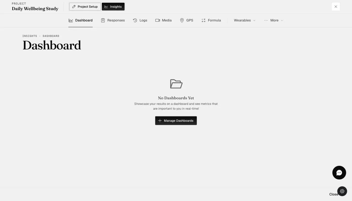
- A pop-up modal will appear, and you can edit or delete the selected dashboard as needed.
Editing and Deleting a Dashboard Visualization
- On the 'Dashboard' tab, click on the three dots in the top right corner of the dashboard visualization or chart you want to edit or delete, and proceed with the required changes.