Mobile charts within surveys
Create Mobile Charts within Surveys with the Chart Question Type
Watch our tutorial video at the end of this article.
When conducting your experience sampling method (ESM) and ecological momentary assessment (EMA) project, you may want to create mobile charts for participants to view when taking surveys. ExpiWell offers a Chart Question Type to display data that participants have entered over time, allowing them to track their progress throughout the study. Essentially, it shows participants their responses over time in frequency or percentage, displayed as a bar graph in the ExpiWell mobile app.
The mobile charts displayed are based on participants’ answers to a previous Multiple Selection question within the same survey. You can select the Multiple Selection question to display for the chart and can choose either count or percentage. You can also specify the chart title and labels for the horizontal and vertical axes.
The following steps show how to create the mobile charts within the survey that participants can view in real-time while taking their surveys:
Step 1: Add a new question on the survey builder page and click on the ‘Chart’ question indicated by the red box in the screenshot below. Specify the chart's title and select the equation type, which can either be a percentage or a count.
For percentage, the denominator is the total number of submissions to the question (not submissions to the survey, as someone can skip this question in the survey). For count, it will be the total number of the selected response choices.
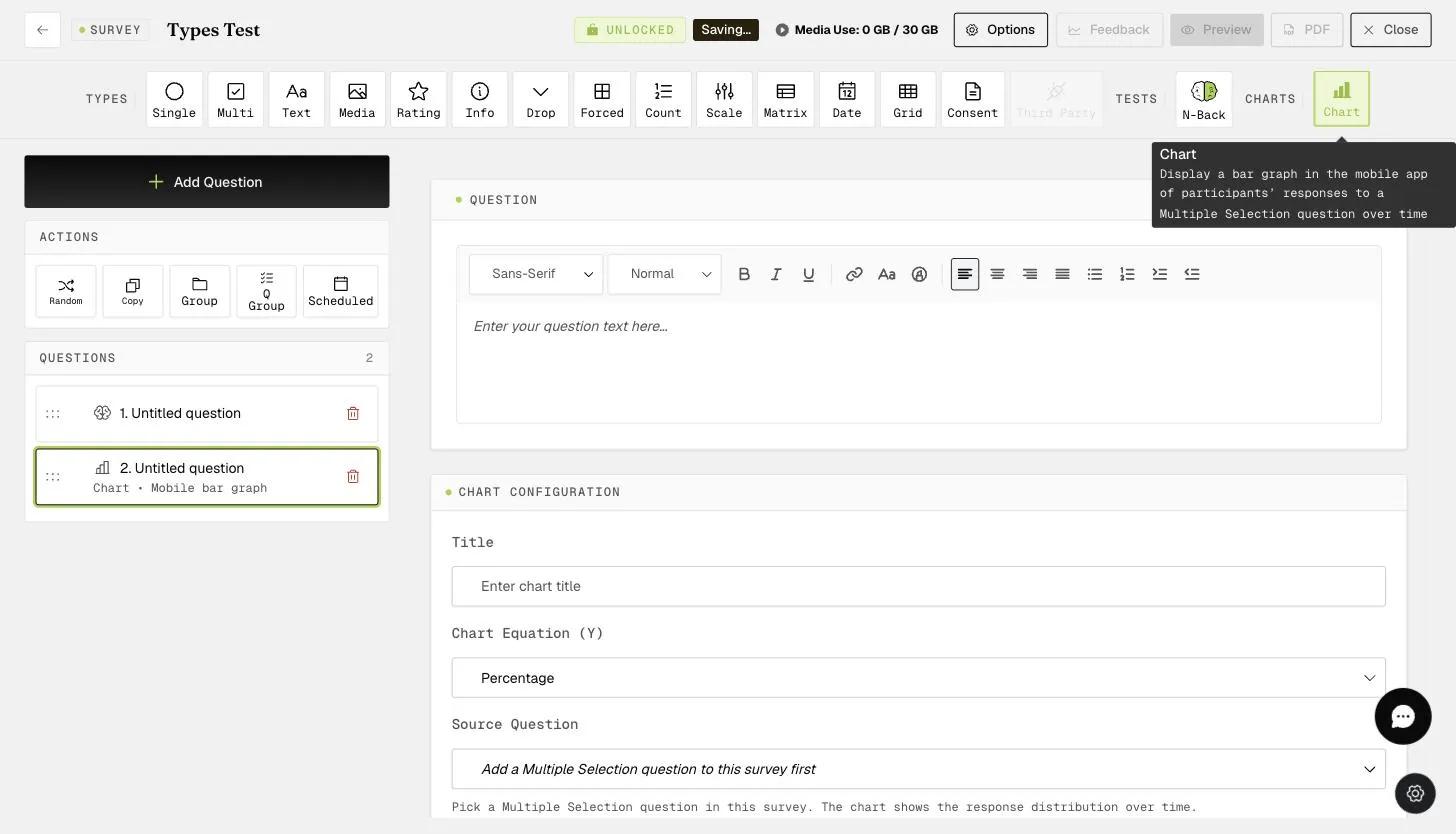
Step 2: Select the Multiple Selection question within the survey that you want to display for the chart.
Note: This chart question only works for survey questions in the same survey.
Step 3: Specify the labels for the X-axis and Y-axis.
You can add multiple charts within the survey or exit the survey builder to continue with the rest of your project setup.
In the ExpiWell mobile app, participants can view the charts in real-time as long as they have submitted their responses when taking the surveys.
Note: The chart question will not show up until participants have at least submitted the question once.
Sample Count Chart based on Daily Activities Question
Sample Percentage Chart based on Emotions Question
As shown below, participants can also click on the individual bars to see the total count or percentage for a particular response option.
This walkthrough was recorded in the earlier ExpiWell interface — an updated video for the new dashboard is coming.